Understanding Video Test Charts
By Marc Spiwak
By Marc Spiwak
For the casual camcorder user, shooting great video is a cinch; there’s nothing to it. You just turn on the camera, make sure everything’s set to Auto, and point and shoot. Even working the zoom is a piece of cake. But professional video production is a lot different.
Professional video production must be as close to the level of perfection as possible, especially if you want to profit from your work. Feature films, for example, are typically created in hundreds of bits and pieces, each created by different teams of people in discrete locations using different equipment in various lighting conditions, especially for shots made outdoors over several days, weeks or months. In the end, all of the bits and pieces must be edited together into one seamless production. Unless you’re paying homage to the low-budget B-movies of decades past, critics and audiences aren’t going to buy into a production in which the focus, light levels and colors are constantly changing. This is where test charts and other calibrating gadgetry come into play.
We couldn’t possibly explain all of the intricacies involved in professional video production in this relatively brief article. After all, it can take decades to master a comprehensive understanding of the process. What we will try to do here is explain the basics behind using video test charts. It’s up to you to invest the time and effort required to learn all the details if that’s a goal you want to achieve.
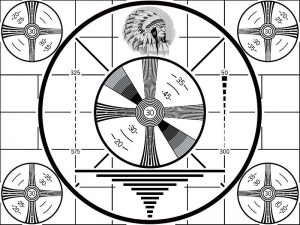
Test patterns—the kind you used to see on TV after the late, late show ended and the station signed off for the evening—are used to illustrate weaknesses in displays. They also used to help users adjust their displays for the best possible image, but modern displays need no adjusting, for the most part. As an example, depending on the resolution of the display you’re looking at right now, some of the sets of lines in the chart below will not be visible as individual lines, instead appearing as a gray rectangle. The image below is not shown in its full resolution, so all of the lines might appear a bit blurry, but you get the idea. You can find high-resolution test patterns online if you want to get a better idea of what they can show you. Note that CRT displays exhibited a lot more weaknesses than flat-panel displays do, especially in the corners, and that’s why test patterns often show the same image in each corner.
Similarly, test charts are used to illustrate weaknesses in video cameras. (Some charts are useful for still cameras, but for the purposes of this article we’re talking about video cameras.) If you had a printed version of the chart above, and filmed it with a video camera, the captured footage would reveal the camera’s resolution.
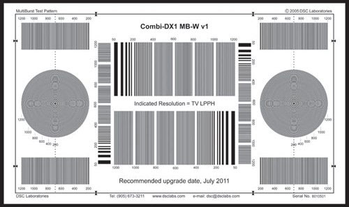
Test charts are also used to calibrate individual cameras so that the scenes they capture appear identical. This is important when doing multi-camera shoots, because you want the footage from each camera to flow seamlessly from one scene to the next. Of course you can always correct for color and lighting issues in post production, but the more you can do to match things before capturing a scene means less work in post—and a better finished product.
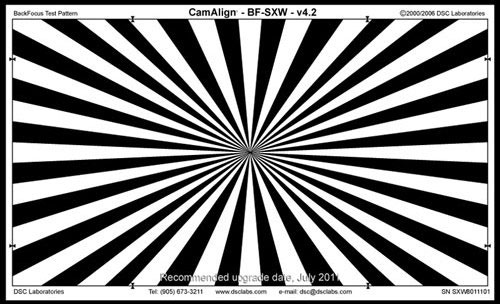
High-end cameras with detachable lenses often have a back focus control that lets you adjust the focus of the lens so that it’s consistent throughout the zoom range. By placing a chart like the one above in the background of your shot, you can calibrate the focus of a video camera. The chart makes it very obvious as to whether a shot is in proper focus. The increasing popularity of high-definition camcorders and TV sets makes obtaining proper focus ever more important.
Different types of charts are used to reveal various weaknesses in cameras and lenses, and charts can also be used to determine optimal settings such as aperture and white balance. You can buy charts and cards that are used only to set white balance, but fancier charts usually include small portions used to check white balance. When you set the white balance of a camera you are basically setting it so that it captures a pure white with no warm or cool tint. In fact, perfect shades of gray, ranging from white all the way to black, should never have any tints either—that is, unless you want them to.
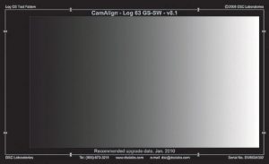
Charts are often used to judge a camera’s performance. For example, if a camera has trouble capturing portions of a resolution chart, then it will likely have trouble capturing fine lines and other details in the real world. If you shoot a gray scale chart like the one above and all of the gradations from one shade to another don’t show up in the captured footage, then dark scenes shot with that camera will probably lack contrast and detail. If a camera fails to capture consistent colors from a test chart, then it will likely have trouble reproducing proper colors in the field.
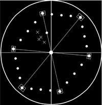
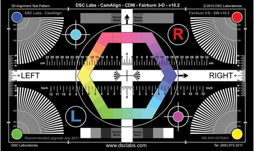
Now let’s talk about color charts. Color charts are designed to indicate whether cameras are capturing colors precisely. While it’s relatively easy for anyone with good eyesight to determine whether or not something is in focus, judging color by eye is far more subjective. That’s why a device called a vectorscope is used to measure colors in a video signal. A vectorscope is a special type of oscilloscope that displays a graphical representation of the colors present in an image, and their intensities. A vectorscope has a circular display surrounding six boxes, each representing yellow, green, cyan, blue and magenta. When you feed a video signal into a vectorscope, dots representing each color that are present in the signal will fall into place in the rough shape of a hexagon, within the circular display.
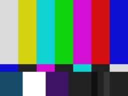
The most familiar color chart is a test pattern, or signal, but it serves as a good example for the purposes of this discussion. The SMPTE color bars, as shown above, is a signal that’s fed to TVs and monitors to check their color displays. When you feed the SMPTE color bar signal into a vectorscope, a dot will—or should—fall into place within each box representing the yellow, green, cyan, blue and magenta colors present in the signal. White, black and gray all generate a dot in the center of the display because those signals contain no color information. The distance from the center of the display to each of the color dots represents the intensity, or saturation of each color.
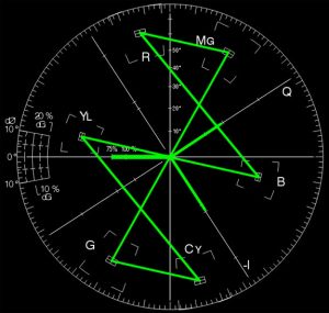
The image above shows the trace formed on a vectorscope display when fed with a SMPTE color bar signal. If the dots don’t fall into the center of each color box, the video signal (possibly recorded by a video camera) does not accurately represent the colors it’s supposed to. That could mean that the lighting was off, settings on the camera were made improperly or the camera was not functioning properly. In any event, by tweaking the camera properly before the shoot, the dots generated by the camera should fall into the proper places within the vectorscope display. And by shooting a few seconds of the same color chart before each scene, the scenes can be color corrected to match the chart so that all of the scenes show consistent coloring. This is, of course, a simplified explanation of how a vectorscope works, but you should get the general idea.
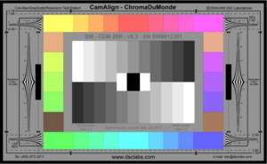
Color charts, such as the popular ChromaDuMonde shown above, are more complex. But they should all, nonetheless, generate a hexagonal trace on a vectorscope when the cameras and lighting are set up properly. Different charts contain different colors and shades of colors so that they produce specific patterns on a vectorscope. You generally use a chart containing colors you will be working with, such as skin tones, so that you can see the effects that different cameras, environments and lighting equipment will have on the shoot. And again, by shooting a color chart for a few seconds in the beginning of each scene, you can properly color match each scene in post production.
DSC Labs is the biggest manufacturer of test charts, and Compuvideo, Leader and Tektronix are some of the more popular makers of vectorscopes. The equipment, and even the charts, are not cheap and can cost more than the video cameras you might be using. But if you’re serious about a career in professional video production, it could be a worthwhile investment.
The charts come in different sizes, depending on how portable you need them to be and how big your set is. For best results, you should be able to zoom in on a chart and have it fill the screen with nothing but the chart showing (as an example, a 24-inch chart is designed to be used at a distance of about ten feet).